
Beyond_The_Ledger

I chose a problem most designers walk past: a government service that already “works” on paper. I wanted to see what digitisation looks like from the back of the queue, not from the dashboard.
Self-initiated, end to end: research, service design, prototypes and a pilot plan
Designed for India’s Public Distribution System, starting with Tamil Nadu
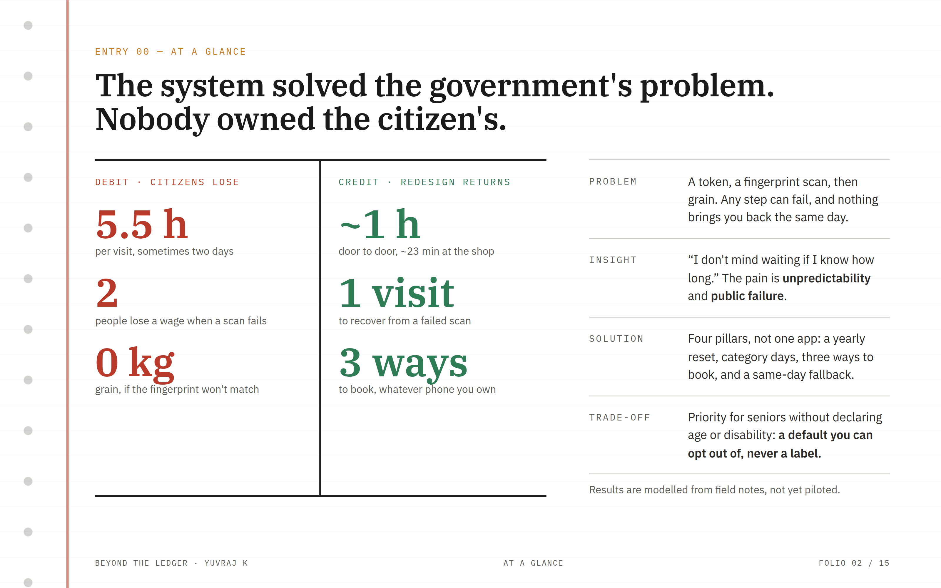
Read this screen as the whole story in one page. Everything after it explains how I got from the left column to the right, and why the answer is a service, not a screen.
The hardest part wasn’t the design, it was deciding what not to build
All results are modelled from field notes and will be checked in a pilot
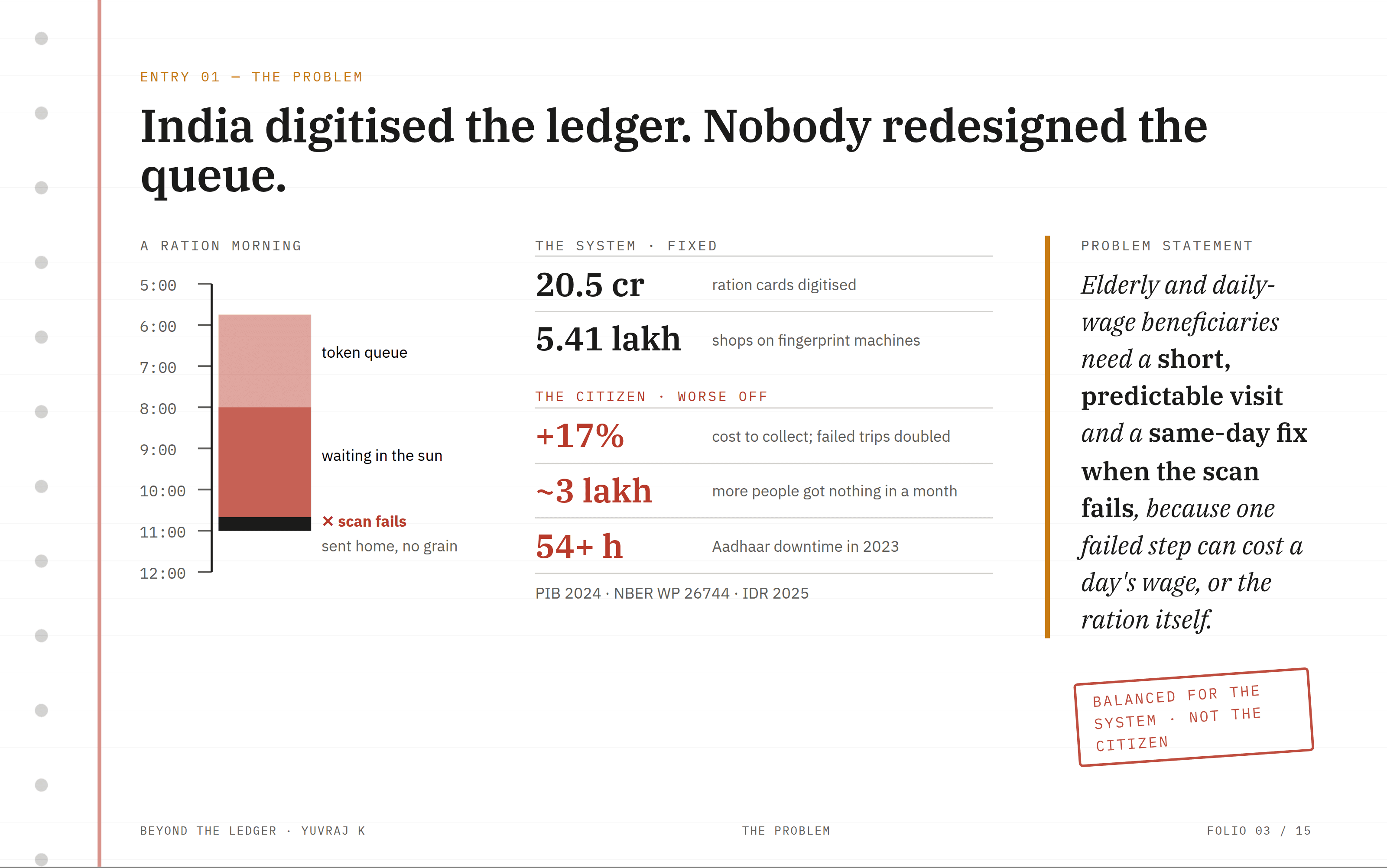
I started with the official numbers, and they said the reform was a success. Then I read the independent studies and the field reports, and they told the opposite story. That gap between the system’s view and the citizen’s view became the project.
I trusted public data and peer-reviewed research over assumptions
Question I carried forward: who pays the cost of a system that “works”?

Service design needs more than screens, so I adapted the usual process. I spent half the project understanding the problem before sketching anything, and I tested the schedule with maths before designing a single UI.
Understanding came first, and making came second
Testing covered the system, not just the interface

I observed ration shops and talked to people in line, and I listened more than I asked. I wrote each observation as a separate note, then grouped them, so the patterns came from the evidence rather than my expectations.
Watching the queue showed what reports never mention: the waiting, and the silence after a failed scan
The quote on this screen became the test for every idea that followed
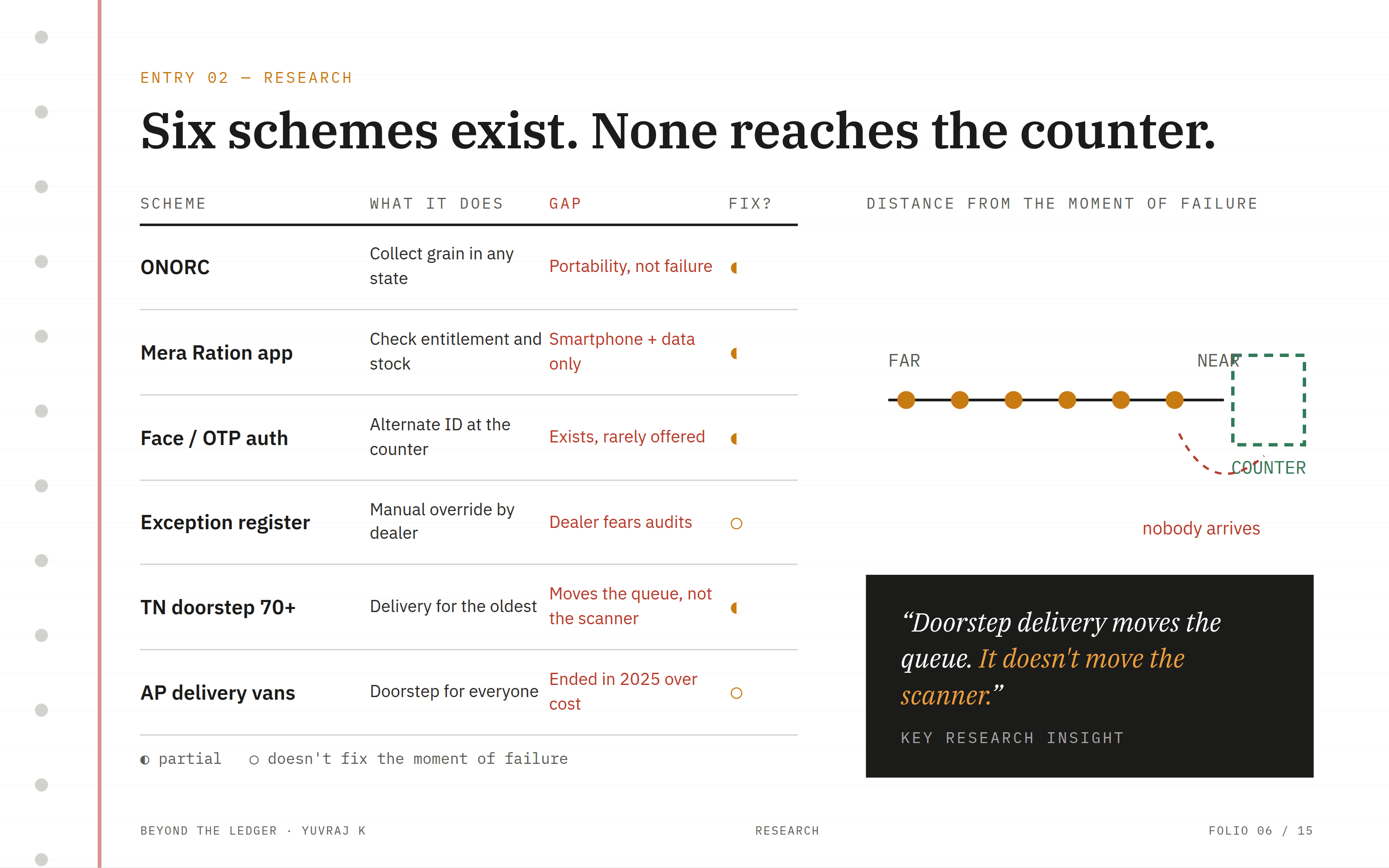
Before designing anything new, I wanted to know why existing fixes hadn’t worked. I found that most solutions improve access to the shop, but the failure happens at the machine. That told me exactly where to focus.
I read policy documents and state-level reports, not just news articles
Decision: make existing fallbacks the default, instead of inventing new ones

I picked the person the system fails most often as my primary user, not the average user. Designing for Krishnan forced every idea to work with no smartphone, no data and a weak fingerprint.
Personas are composites built from my field notes
I added the shop dealer on purpose: if he won’t use it, nothing changes


I generated ideas freely first, then judged them against evidence and cost. I kept my rejected ideas on this screen on purpose, because the reasons behind them are part of the design.
The booking app looked obvious, but it failed my hardest user
A good idea that another state has already dropped is a lesson, not an option

I designed the solution as a system because each part fixes a different failure. Taking away any one pillar breaks the promise that nobody goes home empty-handed.
No new technology or staff, so it can actually be adopted
The shared schedule stops the three channels from giving different answers

I prototyped the same booking in three forms, from a smartphone app to a printed calendar. Designing the low-tech versions first kept the app simple.
The keypad SMS and the calendar were designed before the app
Tamil first, with colour, symbol and word together for low literacy
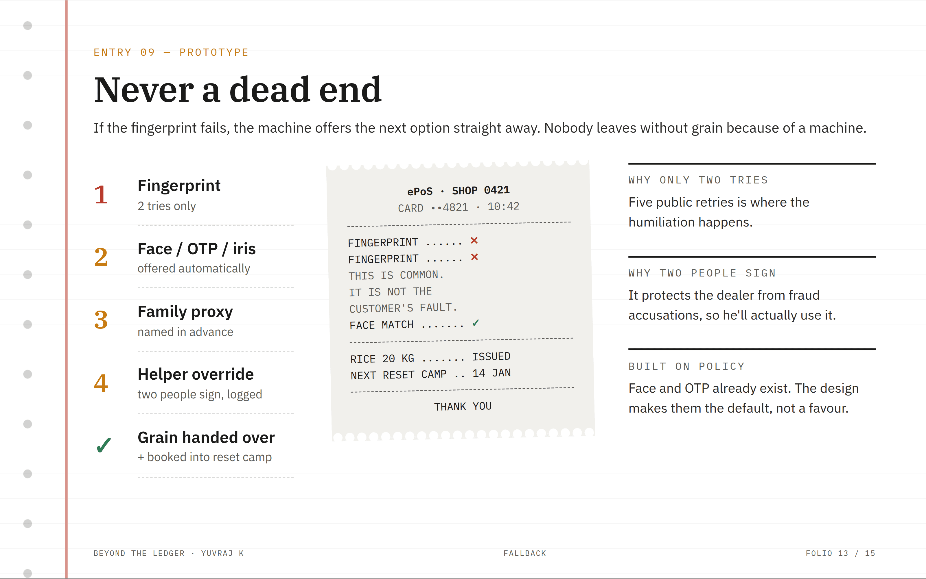
This is the most important screen in the project, because it answers the moment of humiliation directly. I wrote the words on the receipt as carefully as the flow, because the message the person hears matters as much as the steps.
The dealer’s screen and words were designed as carefully as the citizen’s
Every fallback here already exists in policy; the design makes it automatic
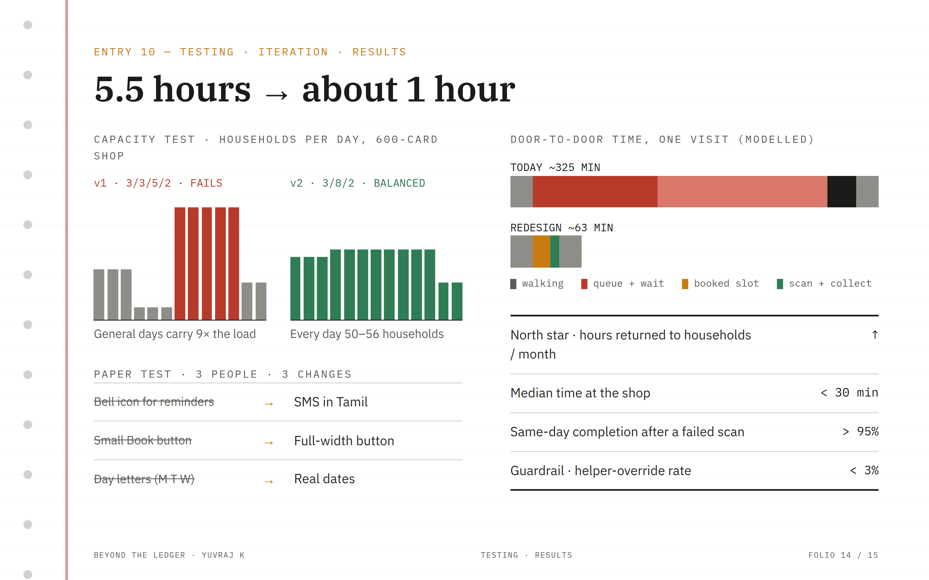
My first schedule looked fair on paper, but a simple capacity model showed it would make most people’s wait worse. Catching that with numbers, before building anything, was the most valuable test in the project. The paper test then fixed the smaller details.
I tested the system with maths and the screens with people
Results are modelled; the next step is a one-shop pilot to measure them for real

This project changed how I think about digital products. The best solution was not the most digital one, and fairness had to be proven, not assumed. I’d like to test it next in a real shop with real dealers.
I now test with numbers before pixels
Dignity is a design decision, not a nice-to-have