

KSRTC Website Redesign
A comprehensive UX/UI redesign of the KSRTC app focused on creating a visually engaging and simply navigated experience. By introducing curated short and long-route trip discovery directly on the home screen and integrating instant AI & contact support, this redesign simplifies travel planning while targeting a 25% increase in leisure engagement and a 15-20% boost in weekend booking revenue.

Role
UI/UX Designer
Duration
4 Weeks
Project
Website Redesign
Industry
Transportation
Tools
Figma, Canva, ChatGpt
Problem
The legacy KSRTC platform suffers from a cluttered navigation architecture that buries specialty tour packages, paired with an unoptimized, data-heavy mobile interface that forces high cognitive fatigue. This digital friction carries directly into the physical world upon arrival at the terminal, where a total absence of live wayfinding or station maps leaves travelers struggling to locate their platform bays and ticketing counters.
Solution
To resolve these friction points, the proposed redesign transforms KSRTC into a streamlined, high-converting travel ecosystem. It bridges the physical-to-digital gap via terminal QR scanning for frictionless app adoption, immediately handing travelers live station mapping to navigate platform bays and amenities. Inside the UI, heavy data density is replaced by a clean, minimalist aesthetic backed by instant AI support for boarding or payment anomalies. Finally, the home screen surfaces curated getaways directly to the user, aligning user discovery with clear business impact: driving a projected 25% lift in leisure route engagement and a 15–20% boost in weekend booking revenue.
My Design Process

Heuritic Elvations

Visual Design

What I Learned Redesigning KSRTC
Balancing UX with Business Goals: I learned how strategically placing curated content (like weekend trips) on the home screen doesn't just improve discovery—it directly drives company revenue and user acquisition
Simplifying Complex Legacy Data: Redesigning a massive public utility taught me how to reduce heavy cognitive load. The goal isn't just to make it look modern, but to make dense data readable and accessible.
Bridging Digital and Physical Worlds: Designing features like station mapping showed me that a travel UX doesn't end when a ticket is booked; the app must seamlessly guide the user through their physical environment (terminals, bays).
Building Trust Through Proactive Support: Integrating real-time AI assistance taught me how crucial instant reassurance is during stressful, high-anxiety moments like payments or boarding.
- 68%
Time-to-Book
Reduced average booking flow from 3m 42s down to a frictionless 1m 11s.
+ 35.5
SUS Usability Lift
System Usability Scale jumped from a failing 48.5 to an "Excellent" 84.0.
+ 18%
Leisure Revenue
Unlocked previously buried KSTDC tour packages via Home screen discovery.
Explore My Case Studies
Look at how I turn complex problems into simple, user-friendly, and effective solutions.
AI Banking Case Study
Read case study

Healthcare UX Audit
Read case study

PharmEasy Mobile Redesign
Read case study
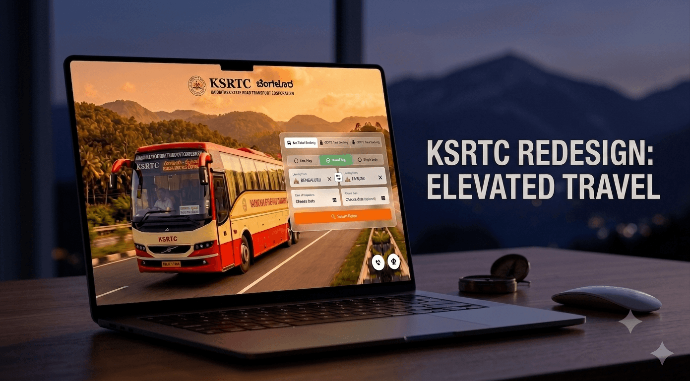
KSRTC Website Redesign
Read case study