
PharmEasy Mobile App Redesign
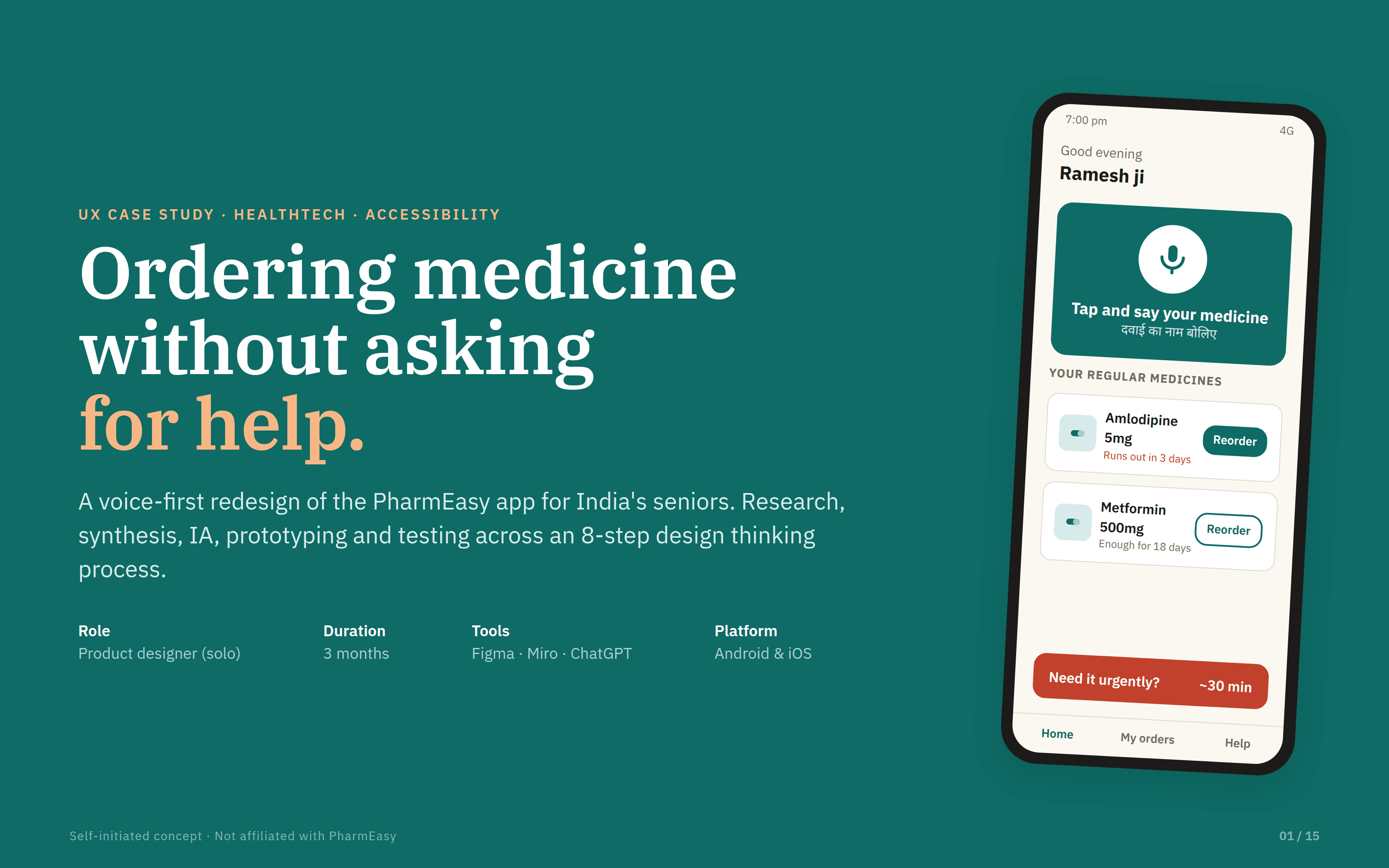
For many older people in India, ordering medicine online means handing the phone to family. I redesigned the PharmEasy app so seniors can order their own medicine confidently, without typing and without fear.
Role: Product designer (solo) · Duration: 3 months - Tools: Figma, Miro, ChatGPT · Self-initiated concept
Probelm
Seniors get lost in the app's menus and struggle to type medicine names.
They worry about hidden costs and delivery times, and 60% never tapped Help because they thought it might cost money.
The real barrier is trust: they're afraid of making a costly mistake with no one to catch it, so they hand the phone to family.
Solution
Voice-first ordering: the senior says the medicine name, in Hindi or English, instead of typing it.
One-tap refills with reminders: a message like "Runs out in 3 days", with delivery shown as a clock time and one all-in price.
A 3-step safety check: the app matches the name to past orders, reads it back with a photo of the pack, then shows the full price and delivery time before anything is ordered.
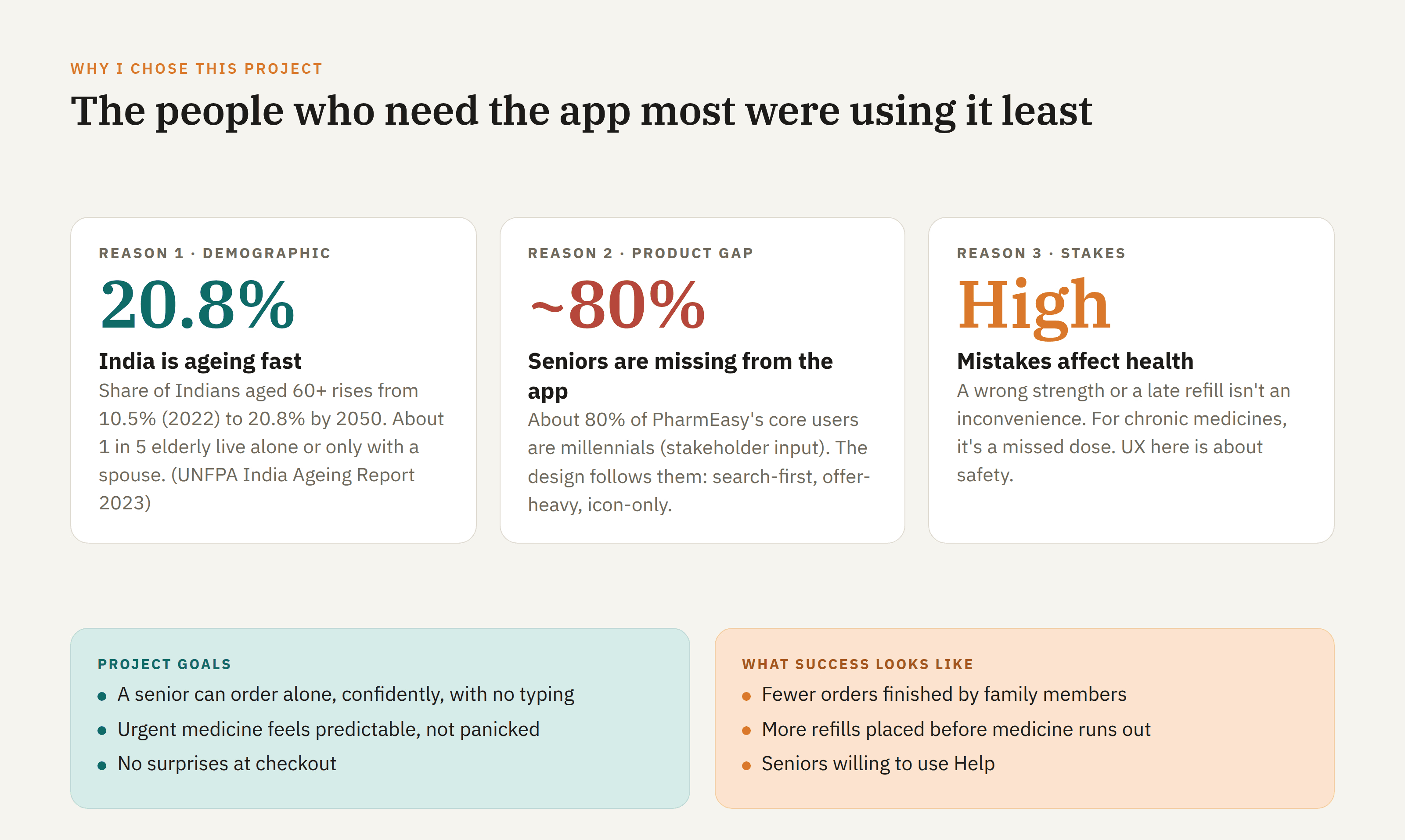
The people who need a medicine app most were using it least. India’s 60+ population is growing fast, yet PharmEasy’s core users are mostly millennials. In healthcare a wrong strength or a late refill is a health risk, so UX here is about safety. - 60+ population: 10.5% → 20.8% by 2050. ~80% of core users are millennials (stakeholder input) - Goal: a senior orders alone, confidently, with no typing

I watched seniors order a real medicine while they thought aloud, then interviewed them. Most struggled, and the most surprising finding was that 60% never pressed Help, because they feared it might cost money. - 58% got lost in menus · 45% were anxious about delivery time · 60% avoided Help - Insight: the barrier isn’t usability, it’s trust

I compared five pharmacy and quick-commerce apps against seven needs from my research. All of them compete on speed and price, and none offer voice ordering, a senior-friendly experience or a safe way for family to help. - Gap: no voice, no senior mode, no family helper - Opportunity: the pharmacy app a 70-year-old trusts to use alone

Geeta, 68, is careful and fears hidden fees. Ramesh, 72, is proud, has arthritis and panics when his tablets run out. They have different personalities but the same root fear: making a costly mistake with no one to catch it. - Each persona is linked directly to the features designed for them

I mapped one real moment: Ramesh’s tablets run out at 7 pm. His feelings drop at three points: typing the name, choosing the pack, and seeing late fees. Each pain point became a design opportunity. - 6 stages, with what he does, thinks and feels at each - Every pain point is paired with a solution

I turned the research into one clear problem statement, five “How might we” questions and five design principles. These principles guided every screen that followed. - Problem: seniors need to order without typing or menus and see the full cost and arrival time up front - Principles: say it or tap it · confirm before commit · clock times · no surprises · simple by default

I explored three ways to start an order (menu-first, search-first and voice-first) and scored each against my principles. Voice won, and its one risk, mishearing, was solved with a read-back. - Menu: rejected · Search: kept as a backup · Voice: chosen - A decision based on evidence, not taste

Voice is fast, but a misheard medicine name is dangerous. Nothing is ordered until three checks pass, and there’s a way out at every step. - 3 checkpoints: match to history → read-back with pack photo → full price and arrival time - Prescription rules are always respected, and nothing is auto-added

Home puts a large voice button first, with one-tap refills underneath. Listening shows exactly what was heard, in Hindi or English. Read-back shows the familiar medicine box and reads it aloud before anything is added. - Say it → see it → confirm it - “Runs out in 3 days” reminders prevent emergencies

Reordering a regular medicine drops from 11 steps to 4, with zero typing, and the full price and arrival time fit on one screen. After launch, the main measure of success would be how many seniors complete orders on their own. - 11 → 4 steps · 0 typing · 1 screen for price and time (modelled) - North-star metric: seniors ordering without family help

In healthcare, UX is emotional safety. Trust mattered more than polish, and every speed feature needed a safety feature. Next, I’d involve pharmacists earlier and run a second round of testing with eight seniors. - Trust beats polish · speed needs safety · design for the family too