
PharmEasy Mobile Redesign
Balanced - 40% reduction): PharmEasy, India's leading online pharmacy since 2015, delivers medicines, lab tests, and doctor consults with unbeatable discounts. Serving 20M+ users across 1200+ cities, this redesign improves accessibility and streamlines the healthcare experience.

Role
Product Design
Duration
6 Weeks
Project
Website Redesign
Industry
Helathcare
Tools
Figma, Canva, ChatGpt
Problem
Many older users cannot easily walk or travel to a pharmacy due to age or health issues. Running out of essential medicine suddenly is scary and dangerous when they are unable to leave the house to get refills.
Modern apps often have too many confusing menus, categories, and buttons. Older users frequently get lost trying to navigate through these complicated screens just to find one simple item, leading to frustration.
Typing on small smartphone screens is very difficult for many seniors. Some struggle with spelling complex medicine names correctly, while others find the physical act of typing painful due to conditions like arthritis.
Seniors are often suspicious of "premium" services. They worry that choosing faster options might involve hidden fees or complicated steps they don't fully understand.
Solution
We added an Ultra-Fast Delivery option specifically for urgent needs. This prioritizes their order to get critical medicine delivered right to their door in under an hour, helping those who physically cannot travel.
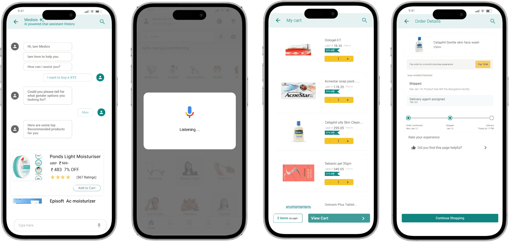
We introduced a friendly AI Chatbot to act as a personal guide. Instead of hunting through confusing menus, the user simply tells the chatbot what they are looking for like a human assistant, and the bot immediately finds it for them.
To remove typing as a barrier, we included a large, Easy-to-use Mic/Voice Input button. Users can simply tap it and speak naturally to find the products they need, without ever needing to spell or type a word.
The AI Chatbot provides instant, plain-language answers to ease worries. A user can simply ask via voice, "How much does fast delivery cost?" and get a clear, honest answer immediately.
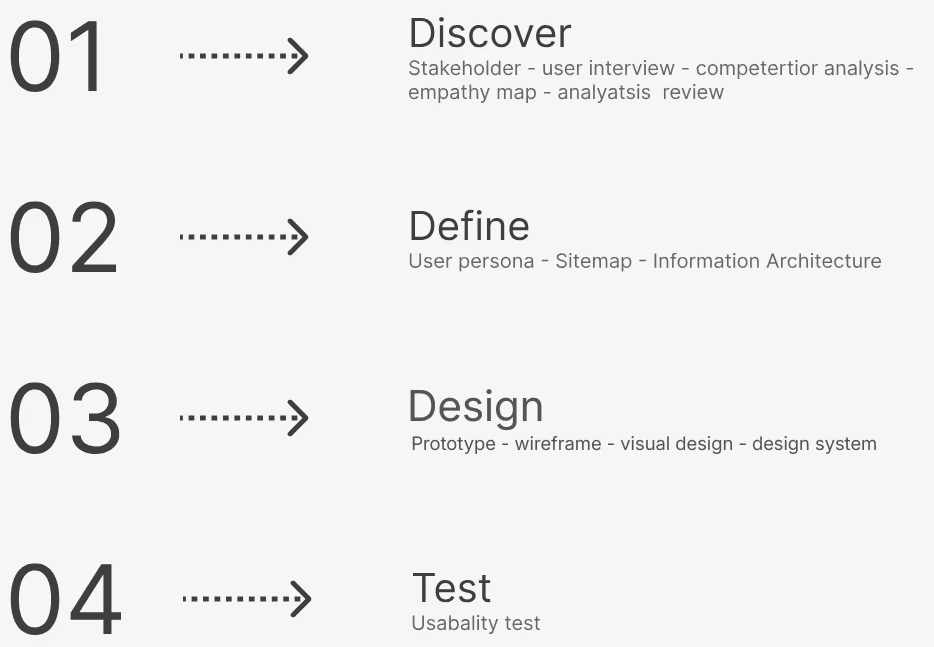
My Design Process
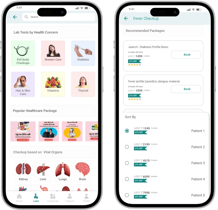
Wireframe


Visual Design



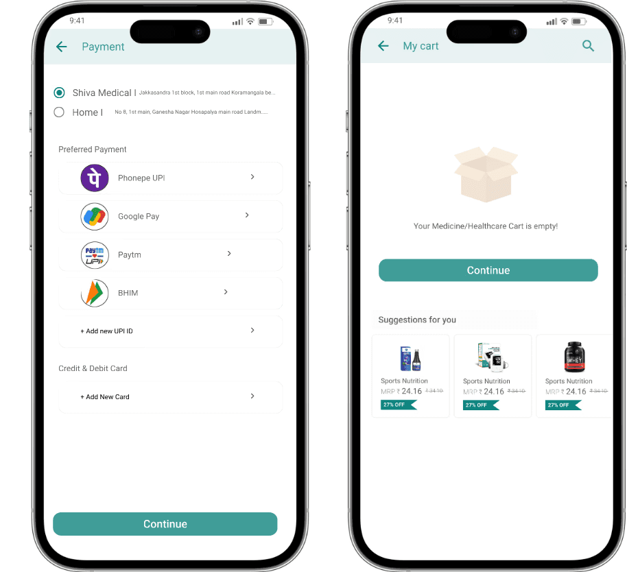
What I Learned Redesigning PharmEasy Mobile
Treating Speed as Emotional Safety: In HealthTech, delivery speed isn’t just logistics—it’s anxiety relief. Designing for homebound seniors taught me that solving real-world panic is the highest measure of UX success.
Replacing Navigation with Conversation: Standard e-commerce menus exclude older users. I learned that the best navigation is sometimes removing the interface entirely so the user can just talk to the app.
Designing Beyond the Keyboard: Accounting for conditions like arthritis taught me that typing is a hidden point of drop-off. True accessibility means designing for the user's physical body, not just their screen.
Overcoming Skepticism with Honesty: Seniors approach digital "upgrades" expecting hidden fees. This taught me that trust isn’t built through slick UI, but through instant, plain-language transparency when a user feels vulnerable.
3.06 Min
Average Session Duration
Reduced average booking flow from 3m 42s down to a frictionless 1m 11s.
+ 25%
Engagement Rate
System Usability Scale jumped from a failing 48.5 to an "Excellent" 84.0.
4.3 Sec
Per Page Session
Unlocked previously buried KSTDC tour packages via Home screen discovery.
Explore My Case Studies
Look at how I turn complex problems into simple, user-friendly, and effective solutions.
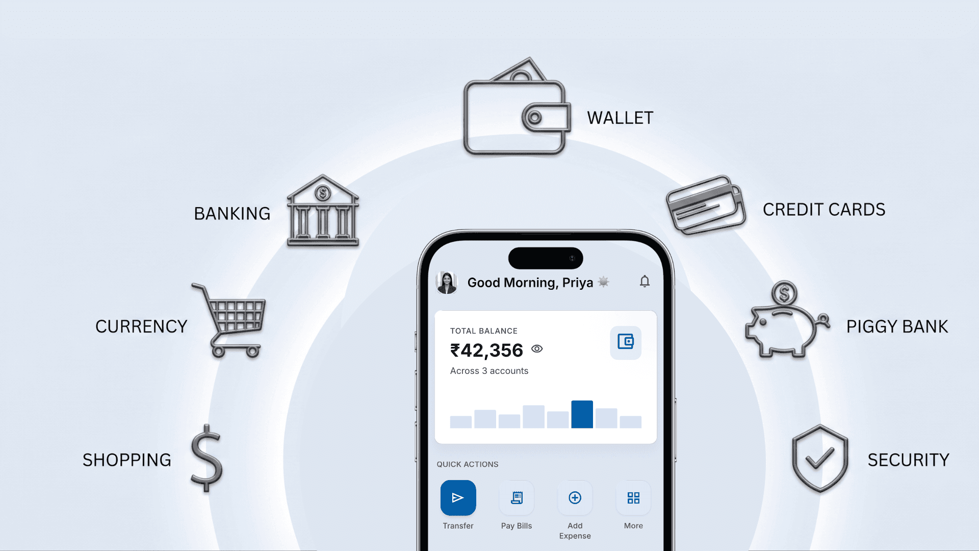
AI Banking Case Study
Read case study
Healthcare UX Audit
Read case study

PharmEasy Mobile Redesign
Read case study
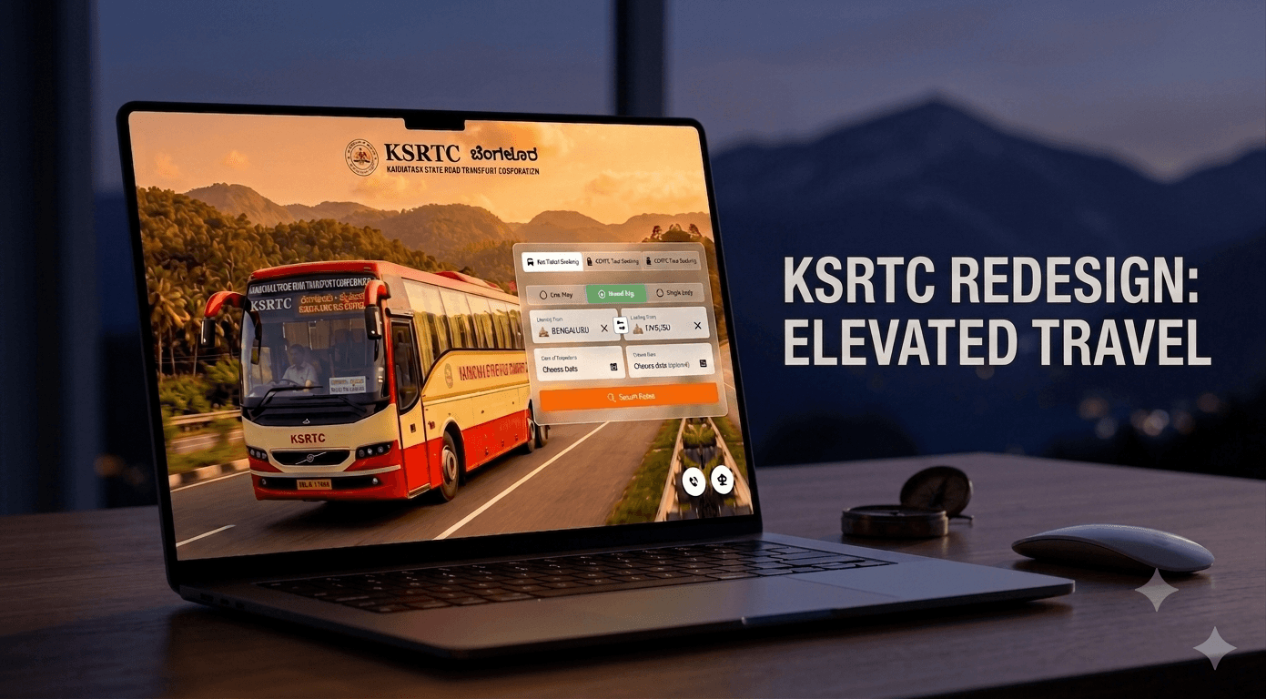
KSRTC Website Redesign
Read case study