PharmEasy Mobile Redesign
Balanced - 40% reduction): PharmEasy, India's leading online pharmacy since 2015, delivers medicines, lab tests, and doctor consults with unbeatable discounts. Serving 20M+ users across 1200+ cities, this redesign improves accessibility and streamlines the healthcare experience.

Role
Product Design
Duration
6 Weeks
Project
Website Redesign
Industry
Helathcare
Tools
Figma, Canva, ChatGpt
Problem
For homebound Seniors, ordering medicine online isn’t just a convenience—it is a lifeline for their independence. Yet, current pharmacy apps actively fail them. Designed only for tech-savvy users, these platforms rely on confusing menus, painful typing methods, and hidden costs, turning the simple task of getting essential medication into a stressful and risky ordeal.
Solution
To remove the barriers of traditional apps, we redesigned the pharmacy experience into an accessible, voice-first platform built for seniors. By replacing complicated navigation and painful typing with an intelligent AI assistant and rapid delivery, the app empowers older users to order essential medicine independently, effortlessly, and without fear of hidden costs.
My Design Process

Competertior Analaysis

Wireframe

Empathy
My Expertise
Focusing on real user needs to build products that are simple and stress-free.
UX Strategy
User Research
User Interviews
Journey Mapping
Personas
Information Architecture
Usability Testing
Product
Product Thinking
Problem Solving
Metrics
Prioritization
Stakeholder Comms
Strategy
UI Design
Design Systems
Visual Design
Auto Layout
Motion
Typography
Accessibility
Design Tools
Figma


Miro

Canva
Sketch

Framer

Photoshop
Methodology
Look at how I turn complex problems into simple, user-friendly, and effective solutions.
01
Empathize
Listen first. Ground every problem in real human context.
02
Research
Synthesize qualitative and quantitative signals into insight.
03
Define
Frame the problem in a way that invites a sharp solution.
04
Ideate
Diverge widely; pressure-test ideas against constraints.
05
Wireframe
Establish structure, flows, and information hierarchy.
06
Prototype
Make it tangible — high-fidelity, interactive, real.
07
Testing
Validate with users; let evidence reshape the design.
08
Iteration
Refine the details until the work feels inevitable.
Information Architecture

Wireframe


Visual Design


What I Learned Redesigning PharmEasy Mobile
Treating Speed as Emotional Safety: In HealthTech, delivery speed isn’t just logistics—it’s anxiety relief. Designing for homebound seniors taught me that solving real-world panic is the highest measure of UX success.
Replacing Navigation with Conversation: Standard e-commerce menus exclude older users. I learned that the best navigation is sometimes removing the interface entirely so the user can just talk to the app.
Designing Beyond the Keyboard: Accounting for conditions like arthritis taught me that typing is a hidden point of drop-off. True accessibility means designing for the user's physical body, not just their screen.
Overcoming Skepticism with Honesty: Seniors approach digital "upgrades" expecting hidden fees. This taught me that trust isn’t built through slick UI, but through instant, plain-language transparency when a user feels vulnerable.
3.06 Min
Average Session Duration
Reduced average booking flow from 3m 42s down to a frictionless 1m 11s.
+ 25%
Engagement Rate
System Usability Scale jumped from a failing 48.5 to an "Excellent" 84.0.
4.3 Sec
Per Page Session
Unlocked previously buried KSTDC tour packages via Home screen discovery.
Explore My Case Studies
Look at how I turn complex problems into simple, user-friendly, and effective solutions.
Healthcare UX Audit
Read case study
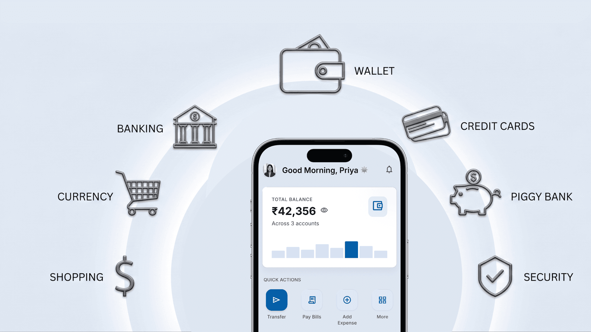
AI Banking Case Study
Read case study

KSRTC Website Redesign
Read case study

PharmEasy Mobile Redesign
Read case study